More CSS
CMPT 165, Fall 2019
More CSS
We haven't talked much about how to move things around the page in CSS.
Fonts, spacing, borders, etc are all relatively easy. The hard part is moving things to where you want them.
More CSS
There are a few ways to position elements around the page…
Float
The float property is often the easiest way to move things around.
It's old and supported in every browser, but not the most intuitive.
Float
Let's start with some HTML to work with:
<h2>Part 1</h2>
<figure id="happy">
<img src="happy.png" alt="happy face" />
</figure>
<p>…</p>
<h2>Part 2</h2>
<p>…</p>
Float
We can move the figure to the left like this:
#happy {
  float: left;
}
The following content flow around it and automatically avoids it: you won't get content overlapping.
Float
That works well for a small image around the main
text, but the way you want to move things around doesn't always map nicely to a float.
e.g. a menu across the top of a page, or down the side of a page.
Clear
When floating content, you often don't know exactly how much space floating content will take, and you don't want some content beside other stuff.
e.g. you don't want to start a section (<section> or <h2>) beside a float from the previous content.
e.g. you don't want code examples (<pre> or <blockquote><code>) with stuff floating beside (because of width restrictions).
Clear
The clear property lets us express move down past any floating content
.
With this, if a <section> starts where something is floating on the left side, move down until the margin is clear.
section {
  clear: left;
}
Position
A more powerful tool: the position property.
Using position give more flexibility in how you place things, but creates the danger of overlapping and unreadable content.
Position
If you set position: absolute, you can then move the element to exactly where you want (relative to the browser window or viewport).
This lets you set the top, bottom, left, right properties to move the corresponding edge of the viewport.
Position
For example, this will put the header 1em from the top of the viewport, and directly against the left of the page.
header {
  position: absolute;
  top: 1em;
  left: 0em;
}
Position
But position absolute removes the element from the flow of the rest of the content: it will go where you put it, even if that's overlapping other content.
It's now your responsibility to make sure there's nothing else in that space.
Position
For example, it's easy to move an element to somewhere other content would also be placed:
#happy {
  position: absolute;
  left: 1em;
  top: 1em;
}
Position
Maybe that's okay if we deal with that element appropriately. Here, make it mostly-transparent and behind the other content.
#happy {
  position: absolute;
  left: 1em;
  top: 1em;
  opacity: 0.25;
  z-index: -1;
}
Position
Or we could move everything else, making enough room for it:
#happy {
  ...
  max-width: 10em;
}
main {
  margin-left: 11em;
}
Position
Or, we could make sure the top 5em of the page is exclusively for the header. Then position in that top 5em however we like.
header {
  position: absolute;
  top: 1em;
  left: 0em;
  height: 5em;
}
main {
  margin-top: 5em;
}
Position
Other values for position:
static: the default.relative: move from the place it would have started (with static position, usingtop,left, etc), but its space is still there.fixed: likestatic, but relative to the window: doesn't move when scrolled.
Position
Absolute positioning isn't actually within the page. It's within the ancestor element that has a non-static position. (And the same for float.)
e.g. in assignment 3, I suggested the main story area be position: relative (with no top, left, etc) so you could move things around inside it.
CSS Grids
More recently, there is another way to move stuff around that makes a lot more sense: CSS grids. They are almost supported well enough that I'd be comfortable using them.
The idea is much more like what I think of when imagining the layout of a page: a blocks on the page, and each element takes up some of the blocks.
CSS Grids
We start by making a grid with a certain number of columns. Maybe something like:
div#grid-container {
  display: grid;
  grid-template-columns: 50% 25% 25%;
}
This creates three columns, taking up half, a quarter, and a quarter of the available width.
CSS Grids
When an element gets display: grid, all of its child elements will be blocks in the grid.
We will be able to move elements around to take up whatever blocks we want…
CSS Grids
Let's try a page with a fairly-realistic structure of a header, navigation menu, and main content:
<body>
    <header>…</header>
    <nav>…</nav>
    <main>
        <section id="intro">…</section>
        <section id="conclusion">…</section>
    </main>
</body>
We will turn the whole <body> into a grid, and we have three elements in it. [Complete file: grid.html.]
CSS Grids
The markup is semantically-meaningful, as it should be. Now appearance: I want a layout like this:
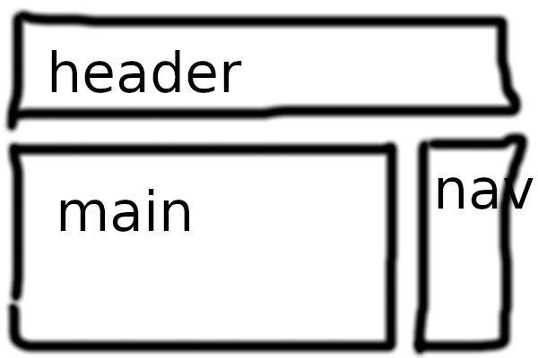
CSS Grids
For that, I need two columns, with the first wider than the second. That can be expressed:
body {
  display: grid;
  grid-template-columns: 3fr 1fr;
}
The fr unit: fractions of the page. Here, the first column is 3× the second.
CSS Grids
We also need to say that the header will span two columns:
header {
  grid-column: span 2;
}
That gets us the layout we want, but with the navigation on the left: elements fill the available blocks left-to-right.
We could swap the order of the <nav> and <main> in HTML, but that's weird semantically.
CSS Grids
We just need to move the <nav> to the second column, and then <main> back up to the second row (below the header):
nav {
  grid-row: 2;
  grid-column: 2;
}
main {
  grid-row: 2;
  grid-column: 1;
}
CSS Grids
Overall, it seems to be a much easier way to format a page. It shouldn't be too long before it's supported well enough to use.
[More complete CSS: grid.css.]
Responsive Design
An important fact to remember: not every web browser is the same size as yours.
Phones exist. Different people have different sized screens. Some people don't maximize the browser window.
Responsive Design
What your page looks like in different size windows isn't always easy to predict: test as much as you can.
Many beginners use position: absolute (or similar) in a way that looks perfect in exactly one screen size.
Responsive Design
A responsive design is one that works well on a wide variety of devices. Probably screen/window size is the most important difference.
At least try shrinking your browser window, and zoom out/in (with ctrl - and ctrl +). Or just try the page on your phone.
Responsive Design
One common problem on large screens: lines too long to easily read. My usual base stylesheet to make things readable:
body {
  max-width: 40em;
  line-height: 1.4;
  margin: 1em auto;
  color: #333;
}
Responsive Design
Also, we need to make one addition to the HTML <head> to make pages work well on mobile:
<meta name="viewport"
content="width=device-width,initial-scale=1" />
Details aside, this says to the browser: I know mobile devices exist and I'll deal with it.
It turns off mobile browsers' attempts to make pages from 1999 look readable on a smartphone.
Media Queries
Very basic CSS will probably look fine on any size screen, but as soon as you start moving things around, a small screen can be too small.
This is particularly true if you are putting elements beside each other (like we did with float, position, grids).
Media Queries
CSS lets you give rules that only apply only in some circumstances with media queries.
The idea: we have a @media (…) {…} block that expresses when the device has these properties …, apply these CSS rules ….
Media Queries
e.g. on a phone-width screen, turn off the floating for figures, and just centre them as a separate block.
figure {
  float: right;
}
@media (max-width: 480px) {
  figure {
    float: none;
    text-align: center;
  }
}
Media Queries
figure {…}
@media (max-width: 480px) {
  figure {…}
}
This media query targets browsers with width ≤480 pixels. On screens that narrow, we can modify as we like.
Media Queries
Similarly, we can rearrange our grid example for small screens: each block takes the full width (two columns), and the <main> goes below the <nav>. [More in grid.css.]
@media (max-width: 480px) {
  header, nav, main {
    grid-column: span 2;
  }
  main {
    grid-row: 3;
  }
}
Media Queries
We can also target the page when it's being printed:
@media print {
  body {
    line-height: 1.2;
  }
  figure {
    display: none;
  }
}
Media Queries
There is a lot of power in media queries to make responsive pages.
Generally, you only really need to solve problems you caused yourself: if you position things, think about how they will look on different-sized screens.
CSS Frameworks
CSS positioning can be hard, especially if you want to be responsive. There are some page elements that many people want to style in similar ways, and we're repeating ourselves.
CSS Frameworks
Much like jQuery and Raphaël for JavaScript, somebody else can write a bunch of code for us and we can use it.
This leads to CSS frameworks: pre-packaged CSS code that solves a wide variety of common CSS problems.
We have seen CSS resets: maybe those are very minimalist CSS frameworks?
Bootstrap
Bootstrap is the most commonly-used CSS framework. Originally created by Twitter.
Getting started: link their stylesheet (and your own).
<link rel="stylesheet" href="https://stackpath.bootstrapcdn.com/bootstrap/4.3.1/css/bootstrap.min.css" />
<link rel="stylesheet" href="customize.css" />
Right away, some basic page styles change to prettier defaults. [Complete file: bootstrap-demo.html.]
Bootstrap
Beyond the default changes, Bootstrap gives you get many classes: just apply them to elements.
Probably the most useful is the grid. The Bootstrap grid is separate from the CSS display: grid functionality, and more broadly compatible.
With the Bootstrap grid, your page is divided into 12 columns. You can put your elements into one or more of them.
Bootstrap
For example: a menu that takes up a quarter of the page, and main content to the right. We just add the classes in HTML to activate the right Bootstrap features.
<section class="container">
  <div class="row">
    <nav class="col-3">…</nav>
    <main class="col-9">…</main>
  </div>
</section>
Bootstrap
We can move things around without worrying about the CSS details ourselves, but at the expense of having appearance-related stuff leak into the HTML.
We can also specify different grid layouts for different-sized browser windows. (sm, md, lg, xl)
Bootstrap
For example, these elements will be full-width on small screens, but 25% and 75% columns on medium (720px) and larger:
<section class="container">
  <div class="row">
    <nav class="col-12 col-md-3">…</nav>
    <main class="col-12 col-md-9">…</main>
  </div>
</section>
[In class="", multiple classes are separated by space.]
Bootstrap
Maybe the biggest drawback: lots of sites use Bootstrap. A page using its standard styles look a little too much like many other sites.
Bootstrap
You can still override the Bootstrap styles to make your pages a little more distinct.
<link rel="stylesheet" href="https://stackpath.bootstrapcdn.com/bootstrap/4.3.1/css/bootstrap.min.css" />
<link rel="stylesheet" href="customize.css" />
In the customize.css, adjust the colours, fonts, spacing, borders, etc to your taste. (But that's the easy part, if Bootstrap can take care of the positioning for you.)