Appearance and Style
Once you have some meaningful markup, it's time to think about how it looks.
Creating Pages 2: Make it pretty
CSS can be used to give appearance information for your pages. If you have meaningful markup, your CSS should be information about how your content should look.
You're expressing things like all paragraphs look this way
or all code examples look that way
.
Creating Pages 2: Make it pretty
You can attach an external stylesheet and give appearance information there.
<link rel="stylesheet" href="style.css" />
CSS Compatibilty
With HTML, you can pretty much use whatever parts you want. It hasn't changed in huge ways recently, and changes are backwards compatible.
With CSS, you have to be more careful with what actually works in browsers.
Some properties do, some don't. Some break weirdly.
CSS Compatibilty
Look for a good CSS reference that's accurate and covers what browsers implement.
Again, the Mozilla reference is probably the best.
CSS Selectors
There are several selectors you likely know:
- Every instance of a tag:
h1{…}p{…} - Usage of a class:
.example{…}code.example{…} - Usage of an id:
#menu{…}ul#menu{…} - Tag within another (descendant):
h1 em{…}. Selects both<h1><em>and<h1><a><em>. - Tag directly in another (child):
h1>em{…}. Selects<h1><em>but not<h1><a><em>.
CSS Selectors
And some you might not:
- Attribute:
q[lang=fr]{…}. Selects<q lang="fr">. - By language:
q:lang(fr){…}. Selects<p lang="fr"><q>and descendants. - Adjacent sibling:
h2+p{…}. Selects<p>immediately after a<h2></h2>:<h2></h2><p>. - Many more:
h2+p::first-letter{…}. Selects<h2></h2><p>Hello
How often to I use these? Rarely, but more than never.
Aside: Tools
You're using your browser's dev tools, right? F12 or ctrl-shift-I or ⌘-shift-I.
Also, Emmet (formerly Zen Coding) for writing HTML.
Box Model
The way “boxes” are arranged in CSS needs a picture:

The background colour/image fills the padding, but not the margin.
CSS Lengths
There are several places where lengths must be given in CSS: margin, width, font-size, border-width, ….
There are several units you can use for length values.
CSS Lengths
- Physical units:
mm,in,pt, …. - Pixels:
px. - Font relative:
em,ex,rem,ch. - Viewport relative:
vh,vw,vmin,vmax.
Also sometimes percent values: %.
CSS Lengths
Several cautions on those…
- The
physical units
are probably scaled to be inaccurate. (Got a ruler? 1in) - A
pxis not a pixel. Especially on mobile. ch,rem,vh,vw,vminonly in IE ≥9.0.vmaxadded even later.
CSS Lengths
That leaves em and ex as nice, compatible, honest length units. They mean what they say, and how they scale is clear.
CSS Positioning
There are a few ways to move elements around the page with CSS.
Suppose we have content like this and want to move the figure around…
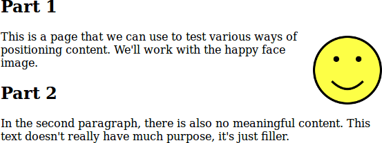
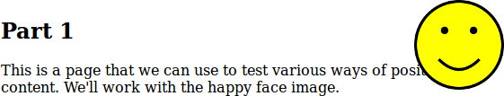
<h2>Part 1</h2>
<figure id="happy">…</figure>
<p>…</p>
Try it: position.html, happy.png.
CSS Positioning
Using float sounds harder but is often easier.
Applying float moves the element to the right/left. The content that follows moves up and flows around the floating element.
CSS Positioning
#happy {
  float: right;
}
CSS Positioning
Using position sounds easier: you can move content wherever you want it, but it can overlap other content.
With position: absolute, you can specify the top/bottom/left/right of the content.
CSS Positioning
#happy {
  position: absolute;
  top: 0;
  right: 0;
}
See also: this example from the CMPT 165 Study Guide.
CSS Positioning
Values for position:
static: the default value.relative: move an element from its “natural” position.absolute: position relative to the page*.fixed: position and don't move when window scrolls.
* actually its closest positioned ancestor, or the page viewport.
CSS Positioning
A more direct option to move things around: the CSS grid properties.
The idea: you define a grid in your CSS, and then position elements into the grid, spanning columns/rows as necessary. Very flexible, and generally better matched to the way people think about their designs.
CSS Positioning
They aren't suppored by IE or early Edge: use a little caution.
Try it: position-grid.html, grid.css, guacamole.jpg.
Responsive Design
Displays come in many different sizes. You can't avoid that.
Be sure to test your site on different screen/window sizes (or at least scale the page to simulate).
Responsive design: a design that works well on a variety of devices.
Responsive Design
Step 1: Don't break things.
The browsers' default CSS will display well in any window size. If it's broken, it's because of something you did, likely positioning or sizing elements.
Responsive Design
Step 2: Tell the browser you know what you're doing.
This line expresses make the page the natural width of the window; don't try to scale to a desktop-sized window
.
<meta name="viewport"
content="width=device-width,initial-scale=1" />
Responsive Design
Step 3: Take control if you need to. You can give CSS rules for different display situations with media queries.
figure {
  float: right;
}
@media (max-width: 480px) {
  figure {
    float: none;
    text-align: center;
  }
}
@media print {
  figure {
    display: none;
  }
}
Don't Overcomplicate
Styles can become complicated. They don't have to be. Enough CSS to make a nice modern page fits on a slide:
body {
  max-width: 40em;
  line-height: 1.6;
  margin: 0 auto;
  padding: 0.5em;
  color: #333;
  font-family: "Helvetica", "Arial", sans-serif;
}
h1, h2, h3 {
  line-height: 1.2;
}
@media print {
  body {
    line-height: 1.4;
  }
}
CSS Defaults
When creating CSS, you're always modifying the browser's built-in defaults. [Defaults for Firefox and WebKit are in their source.]
Those are very similar between browsers, but not identical. Sometimes that can be annoying.
CSS Defaults
Solution 1: throw away the defaults.
CSS reset stylesheets remove all styling from all elements, leaving you with a (boring but) consistent starting point. Drawback: you have to style everything.
Eric Meyer's Reset is the best known.
CSS Defaults
Solution 2: make the defaults consistent.
Normalize.css adapts browsers' defaults and unifies their differences. It's a messy job, but somebody did it for you.
CSS Preprocessors
CSS is a very simple language. That's good. Until it isn't.
It's easy to end up repeating yourself.
.container {
    width: 20em;
}
.something {
    border-color: #A6192E;
    width: 18em; /* .container - 2em */
}
footer a {
    color: #A6192E; /* same as border-color above */
}
That smells bad.
CSS Preprocessors
CSS preprocessors are tools to process (CSS-like) input into actual CSS. Most used: Sass and Less.
These let you define variables, do arithmetic, and generally have better-structured code.
CSS Preprocessors
Previous example can be generated from (Sass' SCSS syntax):
$container_width: 20em;
$brand_color: #A6192E;

.container {
    width: $container_width;
}
.something {
    border-color: $brand_color;
    width: ($container_width - 2em);
}
footer a {
    color: $brand_color;
}
CSS Preprocessors
I often find myself reducing repetition like:
$mainFont: 'Source Sans Pro', 'Helvetica', sans-serif;
$codeFont: 'Source Code Pro', 'Consolas', monospace;

body {
    font-family: $mainFont;
}
pre {
    font-family: $codeFont;
}
code {
    font-family: $codeFont;
}
code.filename, code.url {
    font-family: $mainFont;
}
CSS Preprocessors
Are CSS preprocessors worth it?
Maybe not: why complicate something so simple?
Maybe: I find myself using them more and more.
Or maybe they are partially-obsolete because of CSS custom properties and CSS calculations.
CSS Frameworks
There are many common problems that need to be solved when styling pages. e.g. modernizing default appearances; displaying icons; producing navigation controls; getting blocks arranged nicely on different screen sizes.
As programmers always think: let's solve them once in a library. Collect a bunch of these and you have a CSS framework.
CSS Frameworks
Bootstrap and Foundation are the best known, but there are plenty of others.
In both cases, link their stylesheet (and JavaScript) code, then build on it.
CSS Frameworks
These provide many useful things.
The danger: looking like every other site that uses the Bootstrap defaults. Remember that you can override to customize.
Creating Pages 3: Behaviour
There are three components to web pages:
- HTML for content.
- CSS for appearance.
- JavaScript for behaviour.
We will get back to more JavaScript later, but for now…
Creating Pages 3: Behaviour
Logic can be embedded in HTML and will be executed by the user's browser.
<script src="code.js"></script>
JavaScript is the only language traditionally supported in browsers, so it's the most obvious choice for client-side programming.
… or maybe other things transpiled to JS, like Dart, TypeScript, CoffeeScript.
Creating Pages 3: Behaviour
JavaScript code in the browser can:
- Manipulate the page it's on.
- Contact the server to get info.
- Do whatever a programming language can do.